Making a typeface that one hundred million people see every day is no small task.
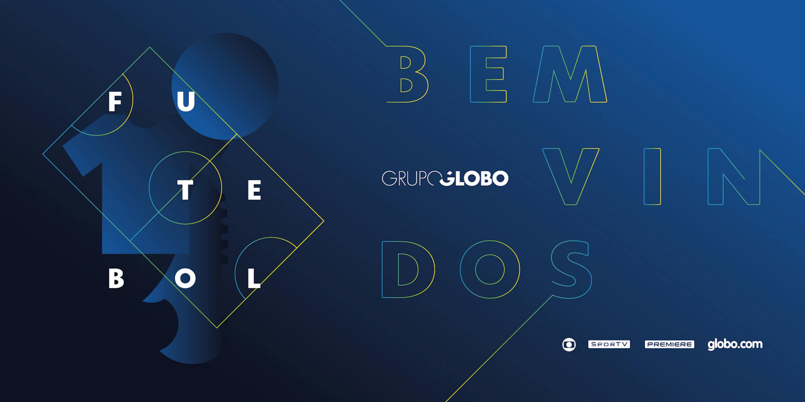
On the occasion of its 50 years anniversary, the brand underwent an extensive review of positioning led by its team. Guided by the ideals of movement and constant flow, it adapts and evolves creatively and technologically to keep bringing information, entertainment and knowledge for Brazilians.
The new positioning brought an opportunity to redesign the family of fonts, creating a more flexible and proprietary tool, one that is capable of carrying these concepts in all communication channels and new platforms.
Plau was invited to take part in the redesign process, in tandem with Globo’s creative team.
Exploring Globotipo’s potential as a variable font
Globotipo Rounded: an evolution of Globo’s iconic type voice created by Hans Donner
Globo is recognized for its avant-garde design, from pre-digital special effects to creative kinectic typography. The language was created and developed over 30 years by the Austrian graphic designer Hans Donner and his team. Donner was also the one who created the unforgettable symbol of the network in a napkin sketch in the 70s.
Prior to Donner’s arrival, the typographic family used by the station was Microgramma(designed by Aldo Novarese and distributed by Nebiolo). The personality of the font is austere and formal, which lends credibility to journalism.
Hans arrived in Brazil and Rede Globo radically changing the typographic scenario of the station. Inspired by the curves of Futura and Vag Rounded, it created the company’s first proprietary font, the Globoface with a trademarked signature feature: rounded letter terminals.
In the beginning, this rounded finish had a technical function: it improved the readability of the letters on tube TVs. Soon became an important part of the identity of the broadcaster — the typographic voice of the company — being used in taglines, sopa opera logotypes to newscasts. Over the years Futura, Avant Garde, Rounded Vag and other fonts were added to the typographic palette and used in advertising and in the shows schedule.
Globotipo Text: a micro-rounded style that strike a more serious tone
Globotipo Condensed: a space-saving width variation of Globotipo Text
30 years later, technological changes have changed the face of communication. From the format of television sets to the birth of new platforms, now more interactive than ever before, the fonts began to fulfill important new functions in their communication.
Inquiring about their use of fonts, we discovered a scale, ranging from institutional to independent. Novels, for example, were treated as stand-alone products, whose identity is thought separately from other shows. News and other products follow the institutional language of the broadcaster, where it was dominated by Globoface. In journalism, the graphic language was undergoing changes, but with little or no update in the typefaces.
Having served Globo faithfully for decades, Globoface had not been planned for a world where content can be consumed on platforms as distinct and high resolution as today.
Therefore, our responsibility was to redesign the typographic voice of Rede Globo, evolving and maturing the personality of Globoface for the future plans of the broadcaster.
Globo’s team arrived at Plau with absolute clarity about how the font family should be:
- Global: carrying the essence of Globoface. The fonts should be the continuation of the personality of the broadcaster, reinforcing the idea of geometry and fluidity, family proportions but not necessarily identical to those of Globoface.
- Multiplataform: for use in all present and future media and formats: wearable technologies, mobile, desktop, television, screen, virtual reality.
- Flexible: multiple weights + italic and with OpenType features that expand creative possibilities in brand communication.
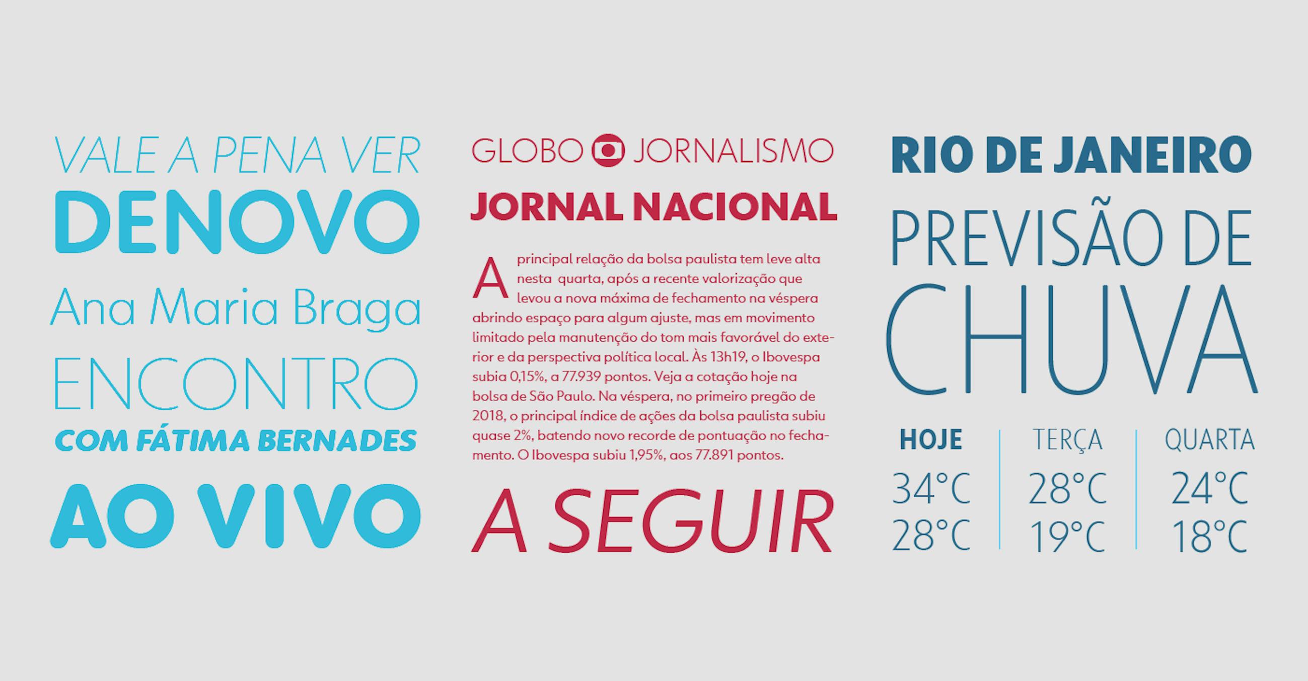
The Globotipo family consists of the following styles: rounded, text and condensed. For each of these styles, 5 weight variations — from Thin to Black — and their respective italics, graduating the text personality from neutral and elegant to dynamic and sweet.
In total, we delivered 30 fonts for use in desktops and apps (.ttf) and webfonts (woff, eot, woff2). We named the family with the Portuguese name of Globoface: Globotipo.
Globotipo is a geometric family of fonts rooted in other examples of the genre such as Futura, Avenir, Gotham, Proxima Nova and many others. Its width is generous and its rounds that tend towards the pure geometric present in the brand’s symbol.
The apertures are wide, which is one of the key differentiation points in relation to the previous family. The termination cuts are 100% vertical and create an organized and sober reading rhythm.
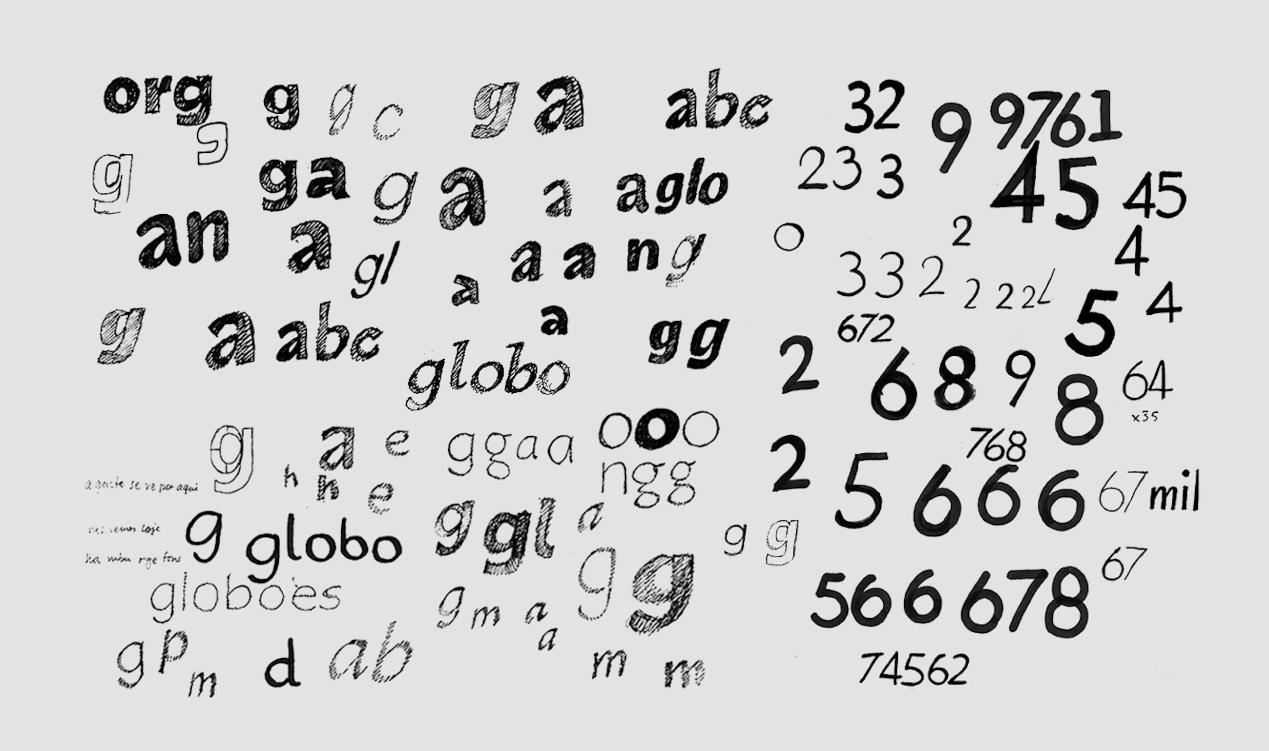
In every font family we have characters that represent the project’s big idea more clearly. In the case of Globotipo these characters are the M with angled legs, the G inspired by the geometry of the logo, the Q with the tail at an angle and without breaking its counter-form and the l with curved a finish, something that helps to distinguish the character from similar ones such as the capital I or the number 1.
One of the key steps for Globotipo to shine on the screens was the hinting, instructions attached to each character in a range of sizes (from 10–24 pt for example) that guarantee the best possible display in low resolution situations or in specific rasterization, Windows rendering being a particularly challenging environment. For this stage, we relied on the experience of Monika Bartels, from Fontwerk. With more than 10 years of hinting and producing fonts, she and her team made Globotipo a pixel-perfect font.
Globotipo Rounded: the most direct reference to the original Globoface, with 100% rounded endings.
Globotipo Text: Created from the same skeleton and proportions of the rounded, with slightly rounded endings, reflecting the concept of fluidity and movement defined by the Globo team. The result is a reliable and friendly font, suitable for text, print and web sizes. Thin and Black extreme weights can be used in titles, logos and other applications.\
Globotipo Condensed: Perfect for titles and whenever ther’s a need to save space. Its composition in capital letters confers a poster like personality to layouts. It can also be used in short leads and the like.
OpenType features
- Alternates for Roman lowercase letters a, land a, e and l in italics.
- Elevated colon for composition of schedules/dates.
- Fractions
- Proportional numbers (for text) and tabular numbers (suitable for tables, infographics and the like)
- Punctuation and symbols for all-caps setting.
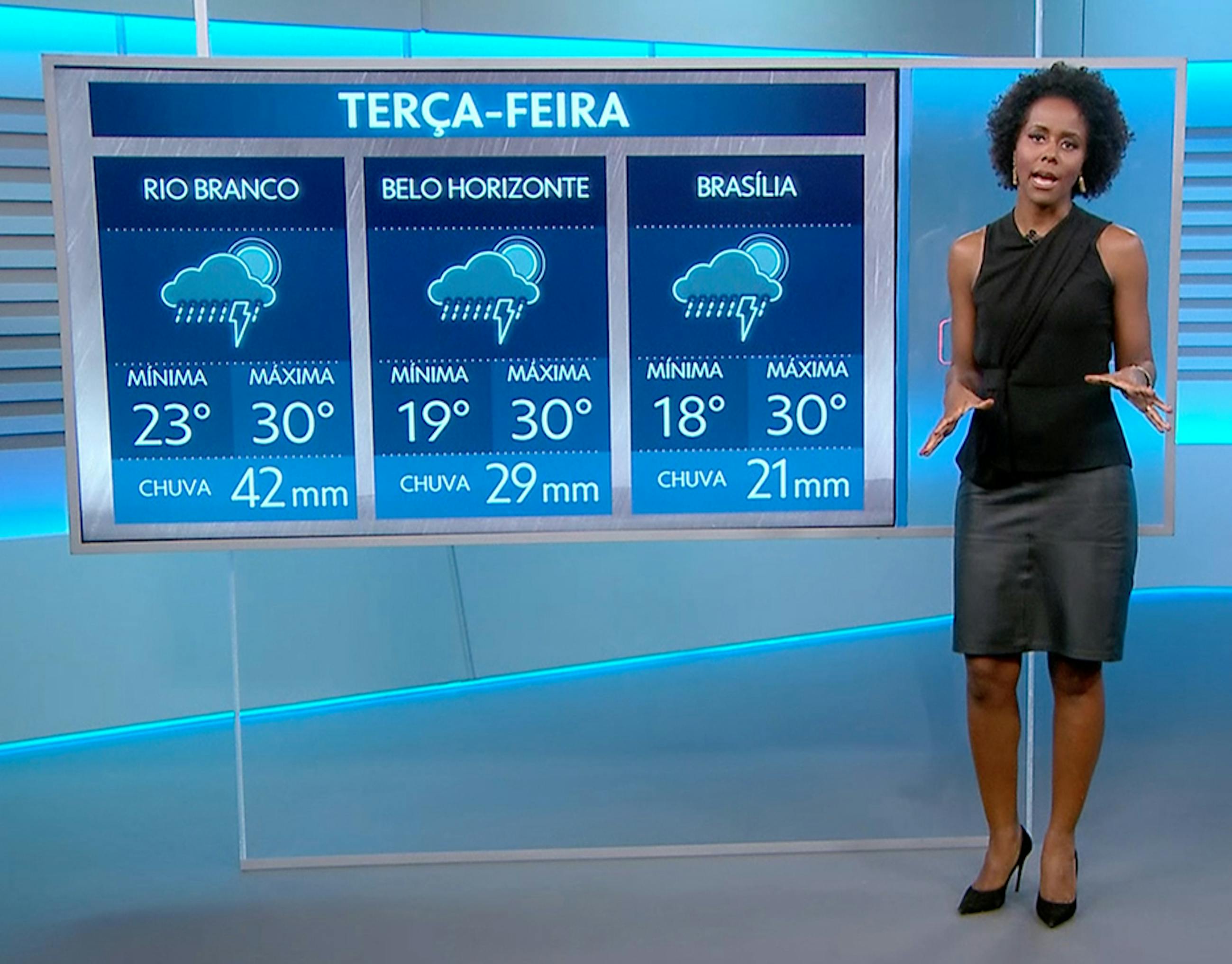
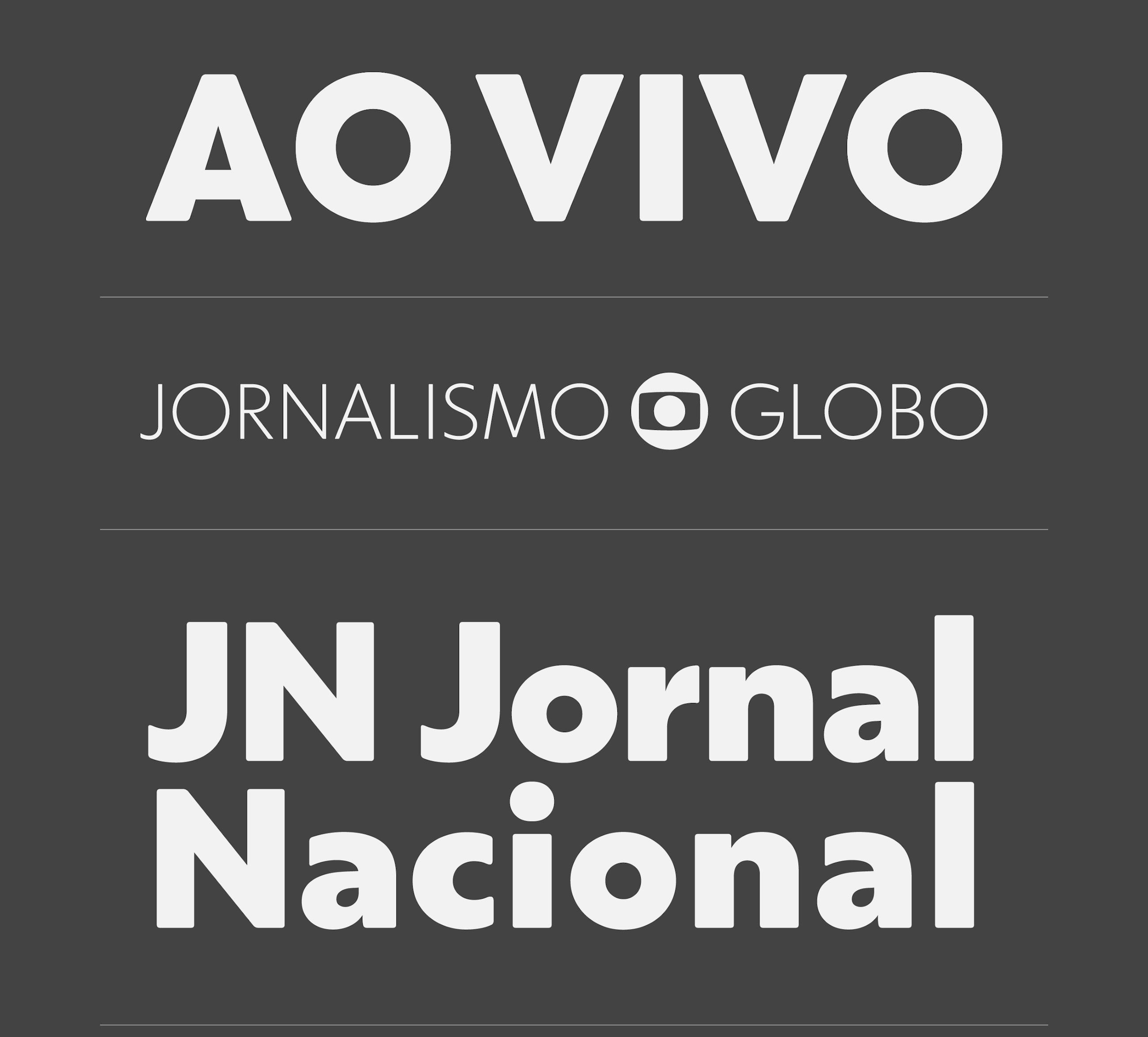
The fonts are used in Brazil's main newscast: Jornal Nacional
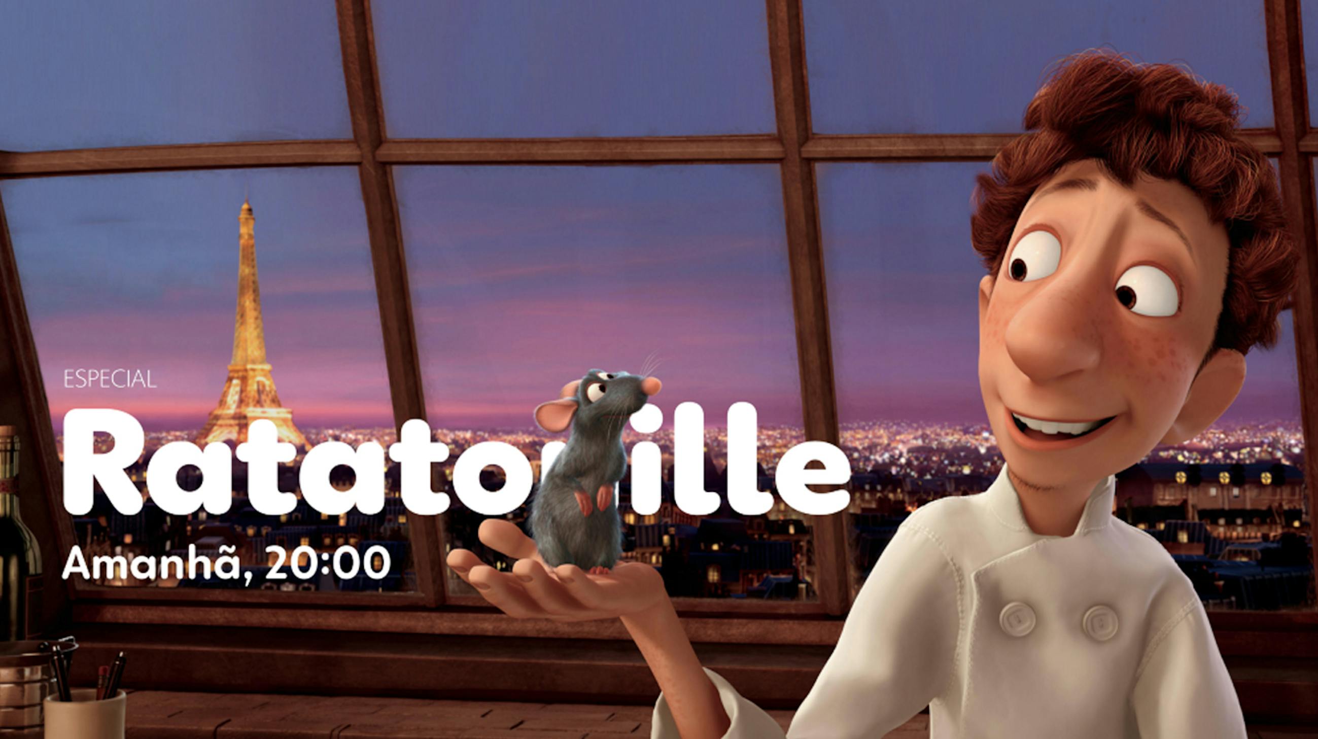
Throughout its existence, Globoface has been subjected to the technological and creative limit: three-dimensional effects, shading, fire, rain, distortion, animation — all you can imagine was done. We did a similar “stress test” to make sure that Globotipo would work in the most extreme use case by Globo’s creative team.

Stress test
The first time we saw used in Jornal Nacional — Brazil’s main newscast — it was a big thrill and pride.
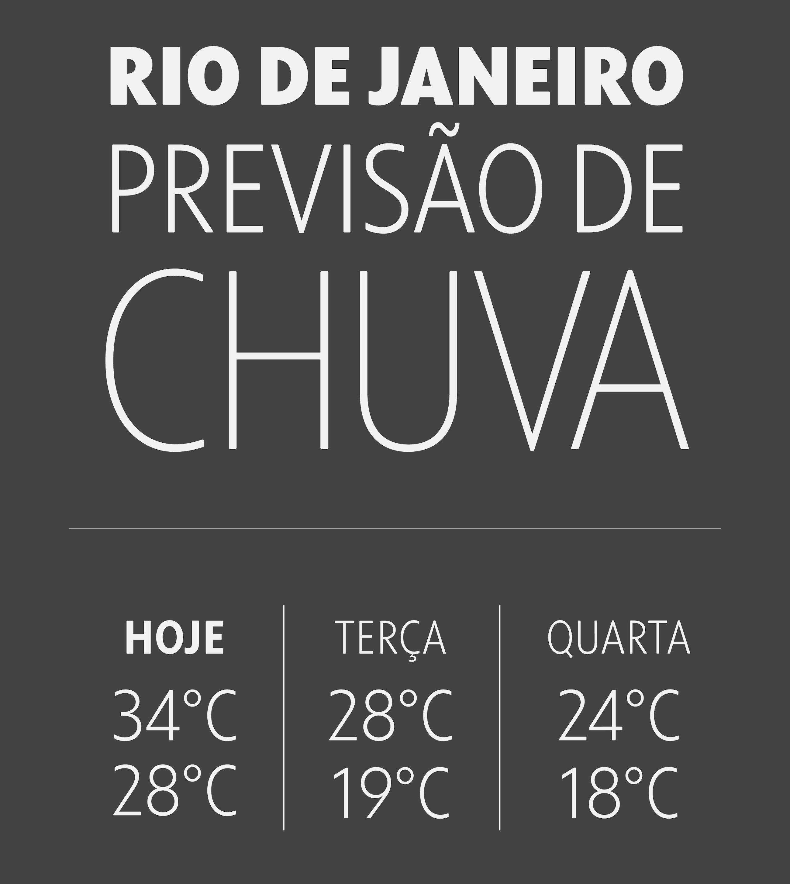
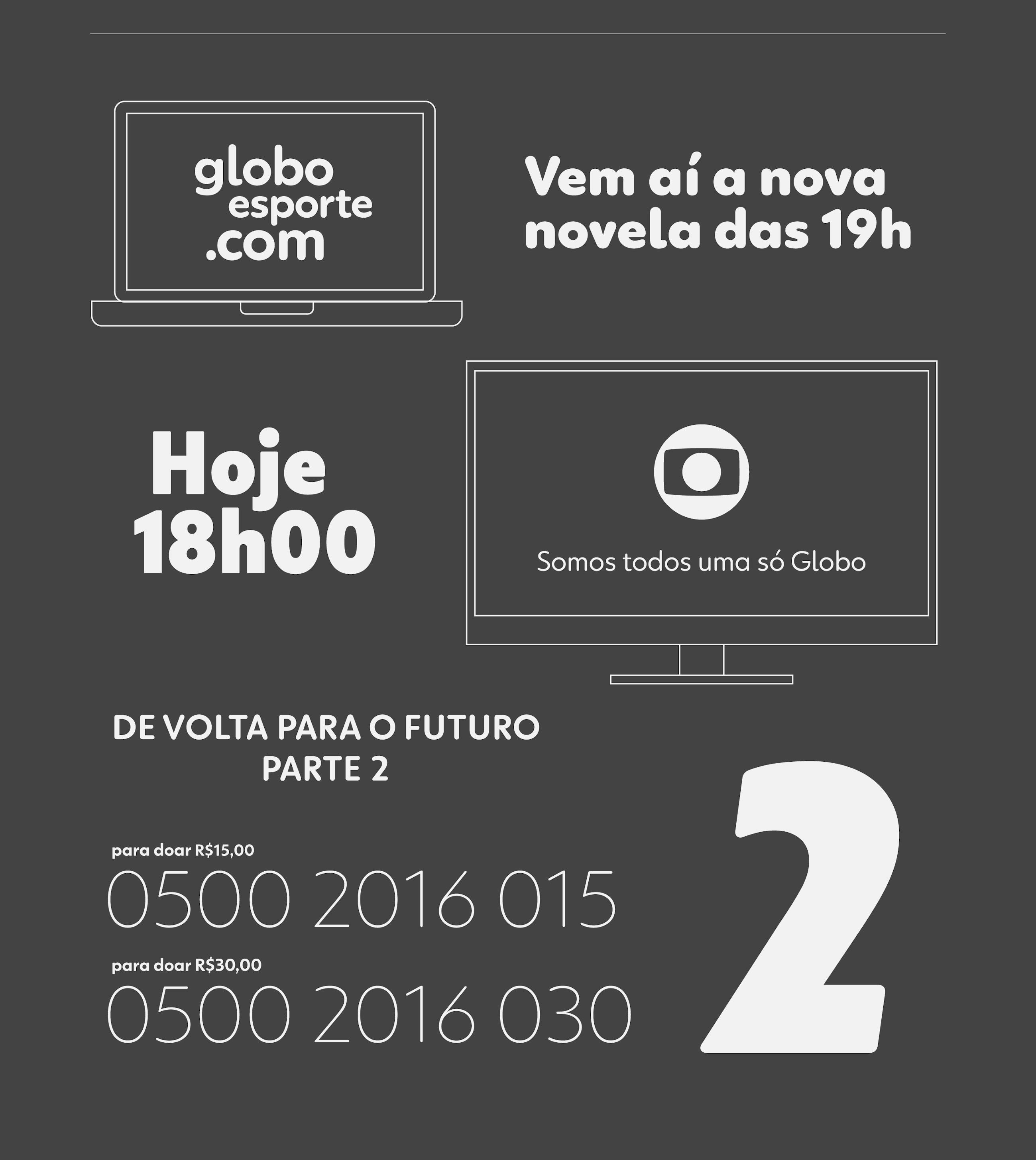
Globotipo is already in use throughout Globo’s institutional communication, expanding the creative range of the communication and art team, entering TV and online programming as they renew their identities. In journalism, regional newspapers in many regions (Minas, SP, Rio de Janeiro and others) and Jornal Nacional already use the fonts to their full capacity, occupying a prominent place in information, infographics and audience interaction.


Making part of Globo’s history is something that we take with great pride and joy. The professionalism, trust and partnership of Globo’s team are experiences that we will always carry in our memory. The creation of the new fonts for Rede Globo is the future that has already begun for the broadcaster, and Globotipo is the typographic voice designed to bring this future to all Brazilians, from early morning to dawn.
Creative direction
Sérgio Valente
Mariana Sá
Art direction
Washington Teotônio
Alexandre Romano
Christiano Calvet
Felipe Bellintani
Type Design
Rodrigo Saiani
Graphic Design
Carlos Mignot
Daniel Rocha
Rodrigo Saiani
Flora de Carvalho
Lucas Campoi
Gabriel Galc
Hinting
Anke Bonk
Tanja Henze
Monika Bartels
Motion & Video Editing
Carlos Mignot
Planning
Carla Sá
Strategic Manager
Bernardo Magalhães
Executive Production
Fernanda Deway
Videocase Footage & Editing
Marcello Cavalcanti
Carlos Mignot
Rodrigo Saiani